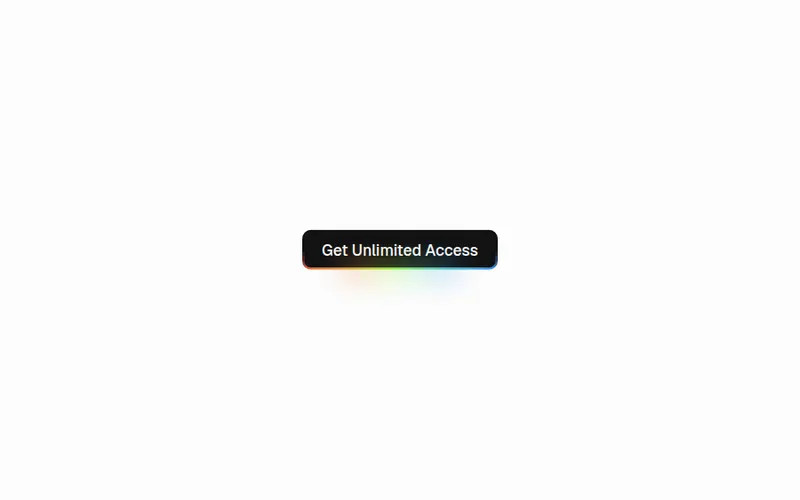
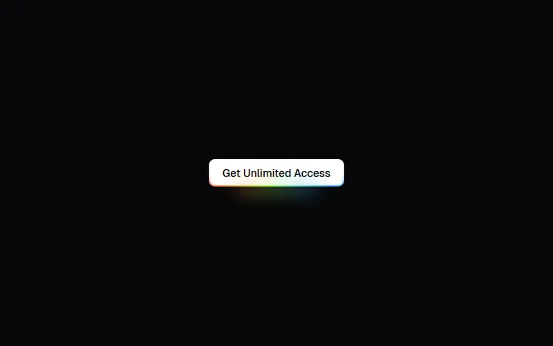
"use client";
import * as React from "react";
import { motion, useMotionValue, useReducedMotion, useSpring } from "motion/react";
import { cn } from "@/lib/utils";

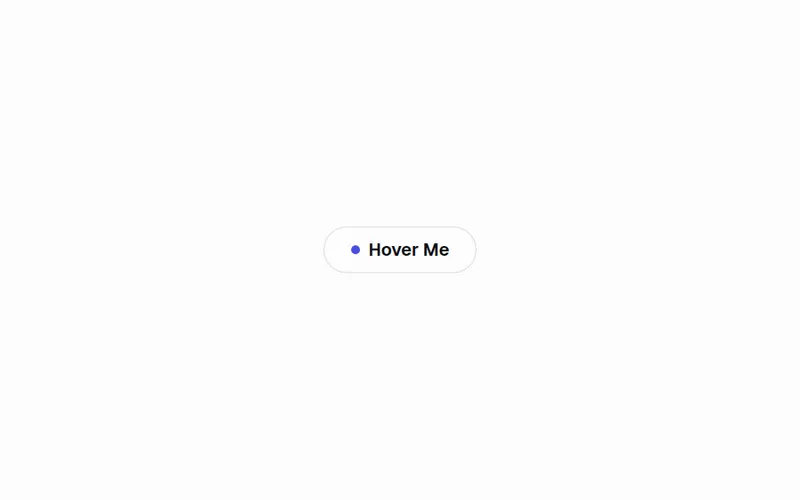
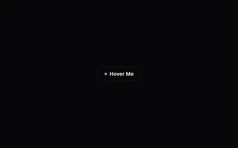
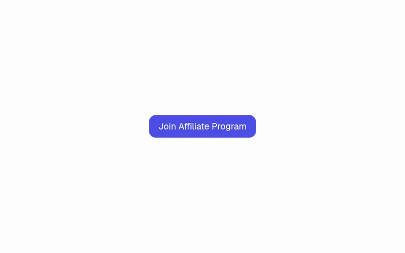
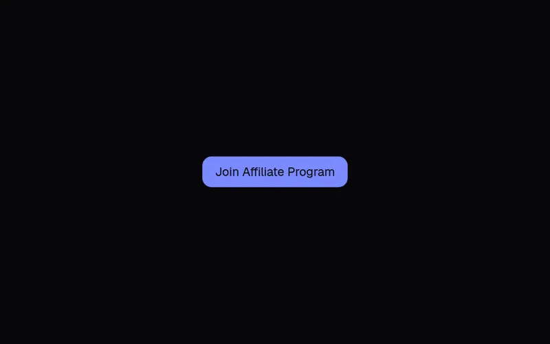
export type MagneticButtonVariant = "solid" | "outline" | "ghost";
export type MagneticButtonSize = "sm" | "md" | "lg" | "icon";

export interface MagneticButtonProps extends React.ButtonHTMLAttributes<HTMLButtonElement> {
  /** Visual style of the shell. */
  variant?: MagneticButtonVariant;
  size?: MagneticButtonSize;
  /** How far the shell follows the cursor (0–1 of the cursor offset). */
  strength?: number;
  /** How far the inner label follows the cursor. Higher than `strength` gives a sense of depth. */
  labelStrength?: number;
  /** Extra invisible hit area (px) around the button that already attracts it. */
  reach?: number;
  /** Spring used for the pull and the release. */
  spring?: { stiffness: number; damping: number; mass?: number };
  /** Class for the outer (layout) wrapper. */
  wrapperClassName?: string;
}

const variants: Record<MagneticButtonVariant, string> = {
  solid:
    "bg-primary text-primary-foreground shadow-lg shadow-primary/25 hover:shadow-xl hover:shadow-primary/30",
  outline:
    "border border-foreground/15 bg-background/60 text-foreground backdrop-blur hover:border-foreground/30 hover:bg-accent",
  ghost: "text-foreground hover:bg-accent",
};

const sizes: Record<MagneticButtonSize, string> = {
  sm: "h-9 px-4 text-sm",
  md: "h-11 px-6 text-sm",
  lg: "h-14 px-8 text-base",
  icon: "size-14",
};

export function MagneticButton({
  variant = "solid",
  size = "md",
  strength = 0.3,
  labelStrength = 0.4,
  reach = 28,
  spring = { stiffness: 220, damping: 16, mass: 0.6 },
  className,
  wrapperClassName,
  children,
  disabled,
  ...props
}: MagneticButtonProps) {
  const reduce = useReducedMotion();
  const areaRef = React.useRef<HTMLSpanElement>(null);

  const x = useMotionValue(0);
  const y = useMotionValue(0);
  const lx = useMotionValue(0);
  const ly = useMotionValue(0);
  const sx = useSpring(x, spring);
  const sy = useSpring(y, spring);
  const slx = useSpring(lx, spring);
  const sly = useSpring(ly, spring);

  const onPointerMove = (e: React.PointerEvent<HTMLSpanElement>) => {
    if (reduce || disabled || e.pointerType !== "mouse" || !areaRef.current) return;
    const r = areaRef.current.getBoundingClientRect();
    const dx = e.clientX - (r.left + r.width / 2);
    const dy = e.clientY - (r.top + r.height / 2);
    x.set(dx * strength);
    y.set(dy * strength);
    // The label drifts a little further than the shell, but never leaves the button.
    const maxX = r.width / 2 - reach;
    const maxY = r.height / 2 - reach;
    lx.set(Math.max(-maxX * 0.3, Math.min(maxX * 0.3, dx * labelStrength * 0.5)));
    ly.set(Math.max(-maxY * 0.3, Math.min(maxY * 0.3, dy * labelStrength * 0.5)));
  };

  const reset = () => {
    x.set(0);
    y.set(0);
    lx.set(0);
    ly.set(0);
  };

  return (
    <span
      ref={areaRef}
      onPointerMove={onPointerMove}
      onPointerLeave={reset}
      className={cn("relative inline-flex", wrapperClassName)}
      style={{ padding: reach, margin: -reach }}
    >
      <motion.span style={{ x: sx, y: sy }} className="inline-flex">
        <button
          type="button"
          disabled={disabled}
          className={cn(
            "relative inline-flex select-none items-center justify-center overflow-hidden rounded-full font-medium transition-[background-color,border-color,box-shadow] duration-300 active:scale-[0.97]",
            "outline-none focus-visible:ring-2 focus-visible:ring-ring focus-visible:ring-offset-2 focus-visible:ring-offset-background",
            "disabled:pointer-events-none disabled:opacity-50",
            variants[variant],
            sizes[size],
            className,
          )}
          {...props}
        >
          <motion.span style={{ x: slx, y: sly }} className="relative inline-flex items-center gap-2">
            {children}
          </motion.span>
        </button>
      </motion.span>
    </span>
  );
}